The people are viewing the world through a window of the size of a business card which has brought in the inevitable changes in logo designs.
Earlier favicons could suffice for the purpose of mobile screens but it is no more easy to keep it that simple. Now, logos must be designed as well be not monotonous or boring. So designer just continue to evolve the meaning of ‘simple’. Logos must always be scalable which is understood. However the meaning of something small has changed to an extent that ‘tiny’ seems to be more generous. Dimension and detail are necessarily removed so that these logos read properly on mobile screens. Designs have become more and more flat. Surfaces are plain and defined by mono-weight lines.
But then there is a limit to everything, even the flattening part . And now people are more and more attracted to anything which brings them closer to reality, something that is hand-drawn, things of histories and cultures. . By bringing back what is man-made, there we gain a sense of control over the digital tide that threatens to overtake us.
There have been many ways the designers have responded to the harsh circumferences of the mobile environment. Artisan crafting has been one of them that has been notices and appreciated in abundance. There is much more creativity incorporated such as introducing long shadows to flat designs which reflects its aesthetic values and the dimensions are much clearer.
With anything you create or write, the primary focus is on balance. Designers will always observe the nature to learn better and more and they will know that the design is swinging between what people want and the technological demands and gifts, just like a pendulum.
We also saw a plenty of admiring examples from our surroundings:
- Mountains, both representing geographic entities as well as a metaphor for achieving great heights or reaching a summit of success.
- Acorns a plenty, as a return to nature and the promise of potential and greatness from an auspicious beginning. These demonstrated planning for the future and as a reminder, the best time to plant a tree was yesterday.
- Bees in every form, and a few hives as well. A versatile symbol of fertility, industry, dedication and teamwork. All the critical ingredients for a sticky reward delivered without a sting.
- Digital controllers, whether for a game or otherwise, seem to symbolize the ability to manage any challenge at the push of a button or flick of the wrist.
- Symbols are being adopted by consumers at an extraordinary pace, and many of these from digital devices or associations with that industry. Clouds, Wi-Fi waves, loading wheels and a rush of icons from our mobile devices are providing the analogies for the next generation of logos.
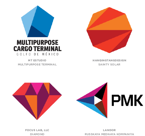
- Faceting cannot be stopped as it continues to evolve. Since it first hit the scene in 2010 it has sprouted more offshoots than a hydra at a knife fight.
The Trend Report
Based on what we have understood of logo trends here are some great trends we have for you to study-
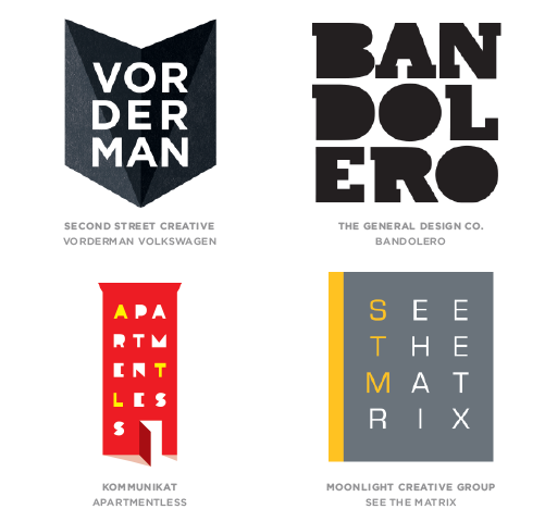
Mono Crest
We identified at least five strains of mono including the most ubiquitous “Mono Script,” “Mono Icons” and this year’s “Mono Crest.”
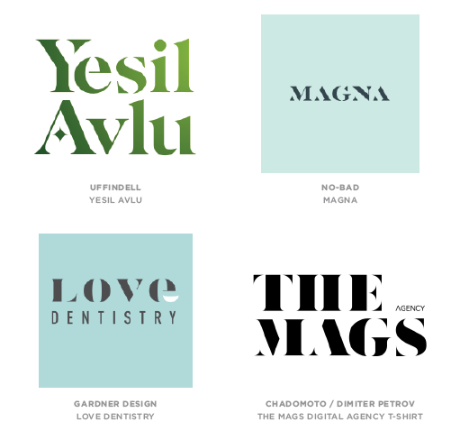
Letter Stacks
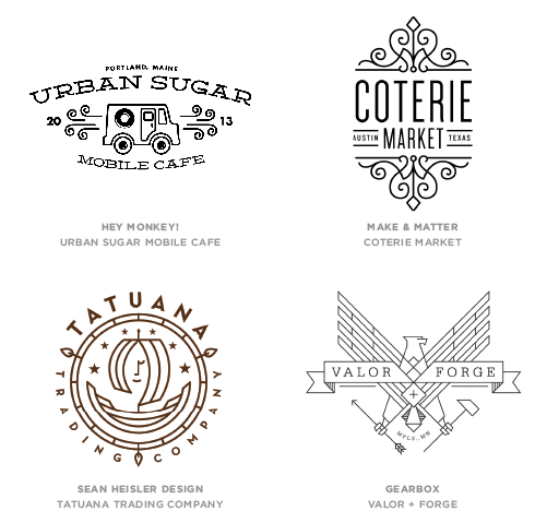
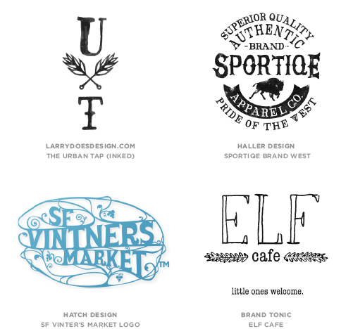
Hand Type
Dazzle
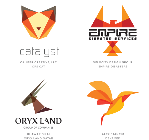
Flat Facets
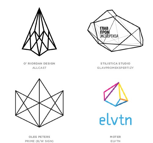
Geo Wired
Trans Menagerie