Logos, The Minimal And Simple View

logo-lounge-custom-typography-logo

Things have changed, views have changed. People are moving from the bulky to the optimal and minimal and so is happening with design. Gone are the days when businesses chose to make heavily clustered bold illustrations as their brand identity, as their logos. It is all about modernising.

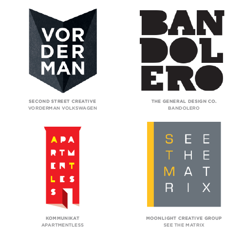
These logos have been created in the last 10 years or so, more simple with clean lines and negative space.

Click on the logos you like!

aat beyon blast defense farmhouse foodwriters freedom hatch hive huskies hysinger koala lark martinnewcombe mind nocturnal ogami pagepro retrocorp skibrand steel williamson


Related Posts

Privacy Preferences
When you visit our website, it may store information through your browser from specific services, usually in form of cookies. Here you can change your privacy preferences. Please note that blocking some types of cookies may impact your experience on our website and the services we offer.