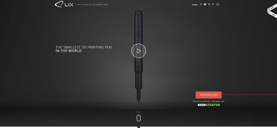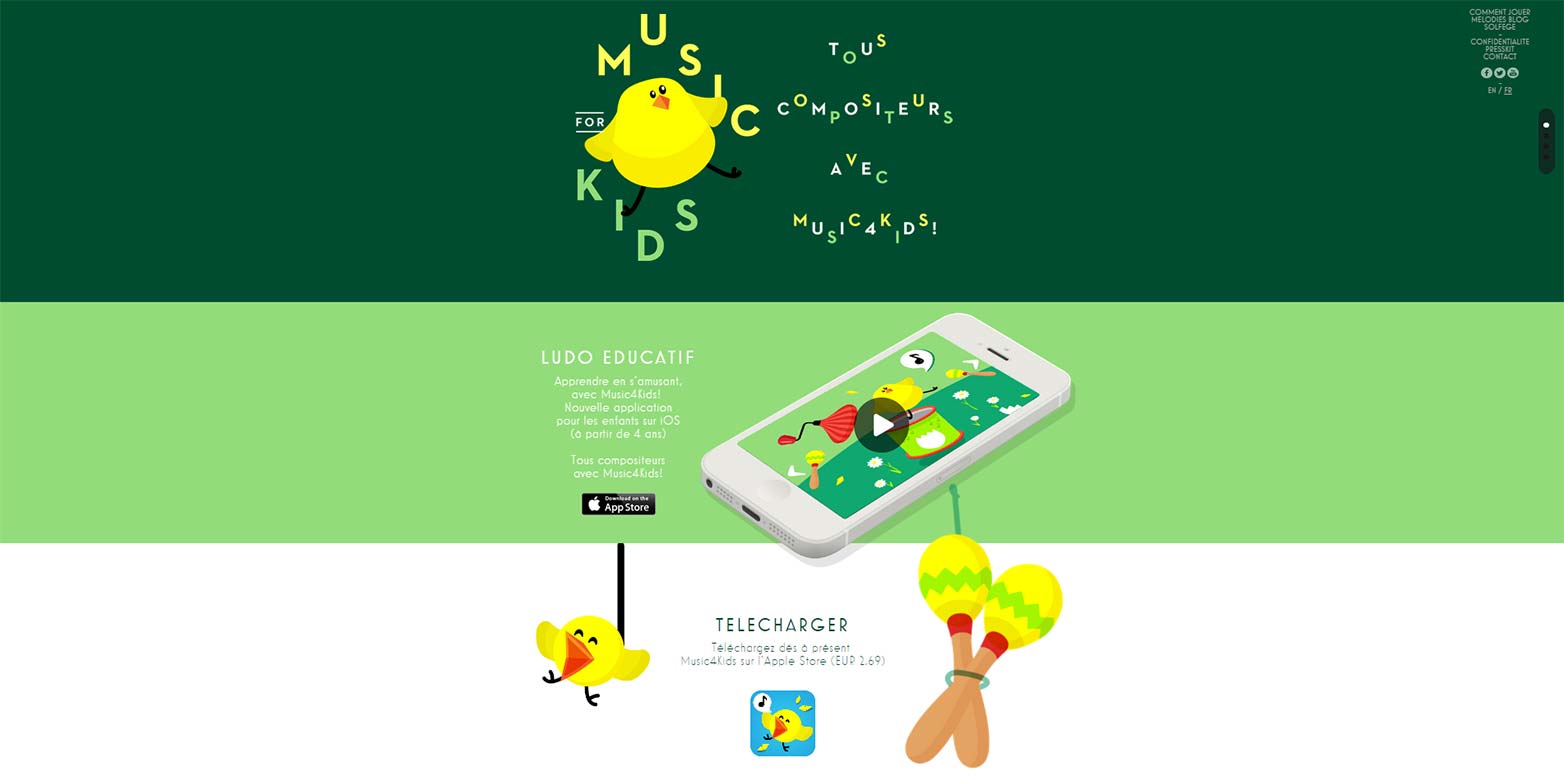
A new web design, and you are making notes of all the essential elements for this website and creating its composition. Have you considered focusing on the typography too, especially when you are building a dynamic design? Sometimes your message is conveyed in so much chaos that the readers are confused and lost. So here we have a flow of steps that will help you convey your message much organised and will effectively make a reach across your readers making text simple.
1. Less typefaces is more
One is well, two is safe, more than two is not really making any sense as the hierarchy of your content is lost. The idea is to keep your customers interested and reduce any kinds of distraction on the page. You may do interesting pairing for example one could be for your header and the other can be the content body.
2. Twisted tale of contrast
Serifs and sans-serifs are like the more omnipresent fonts and are also in the basics of principle of design. This one is a beautiful combination of the twisted and the plain. Try keeping it as sorted as possible as these two vivid fonts if used over can cause distractions in your web design.
3. Tone is important
There are quite a few categories in these fonts as well. A playful and serious pairing is going to take away all the charm of the heart of the message you want should reach your customers.
4. The sizing game
Bold or paragraph? Type is quite interesting, the bolder it is more likely your content will get noticed. But that does not mean the body text is all in bold and big letters as well, because that then I going to be a big setback. Select your font sizes according to the priority of your information.
5. Color blush
Color bring life to anything, like literally. But there are actual relevance to colors that have the ability to define emotion and purpose. What you want to imply can be very well understood by what colors you use which also helps in maintaining the hierarchy. You can use colors to intensify or create playfulness.
6. Watch the whitespace
Whitespace is beautiful but how much? You cannot crowd your text disturbing the pattern as many people will simply move on and not bother to read. There has to be enough space to make sure that it looks clean and simple. After all it is all about visual hierarchy.


